Case study · Software
One product on the web, iPhone and Android — where the design cannot quietly drift apart
Visit the live site atscale.snacksit.workers.dev
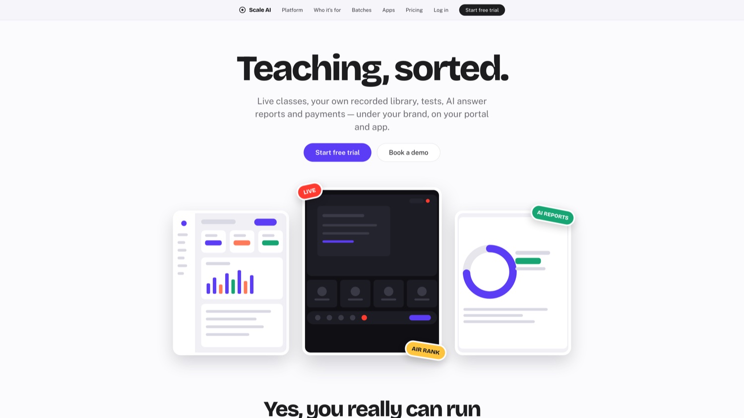
What it does
- Web app
- iOS app
- Android app
- Live video
- Design system
Industry
- Software
The usual way to build a product for web, iPhone and Android is three teams, three codebases and, eighteen months later, three products that no longer look like each other.
At Scale is one codebase that compiles to all three. A change ships everywhere on the same day, and a screen looks identical on every device because the illustrations are vector, not exported images.
The part we are proudest of is the check: every build is automatically compared against the original design, pixel by pixel. If someone nudges a padding value and the screen no longer matches what was signed off, the build tells them. The design cannot drift, because drifting fails the test.
It includes live video calling in the app, and it is deployed globally so it loads fast wherever the user is.
Website, iPhone and Android — identical, shipped together.
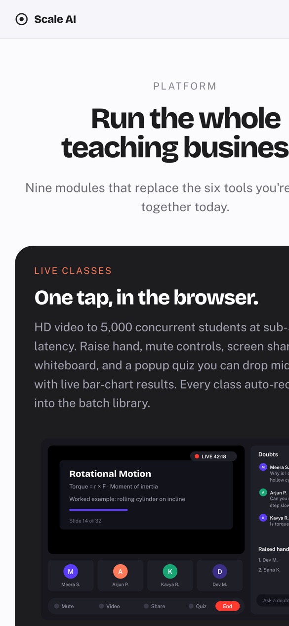
On the phone
The same product on a small screen — the version most people will actually use. Built from one codebase, so nothing drifts between the two.
Visit the live site atscale.snacksit.workers.dev
More of our work
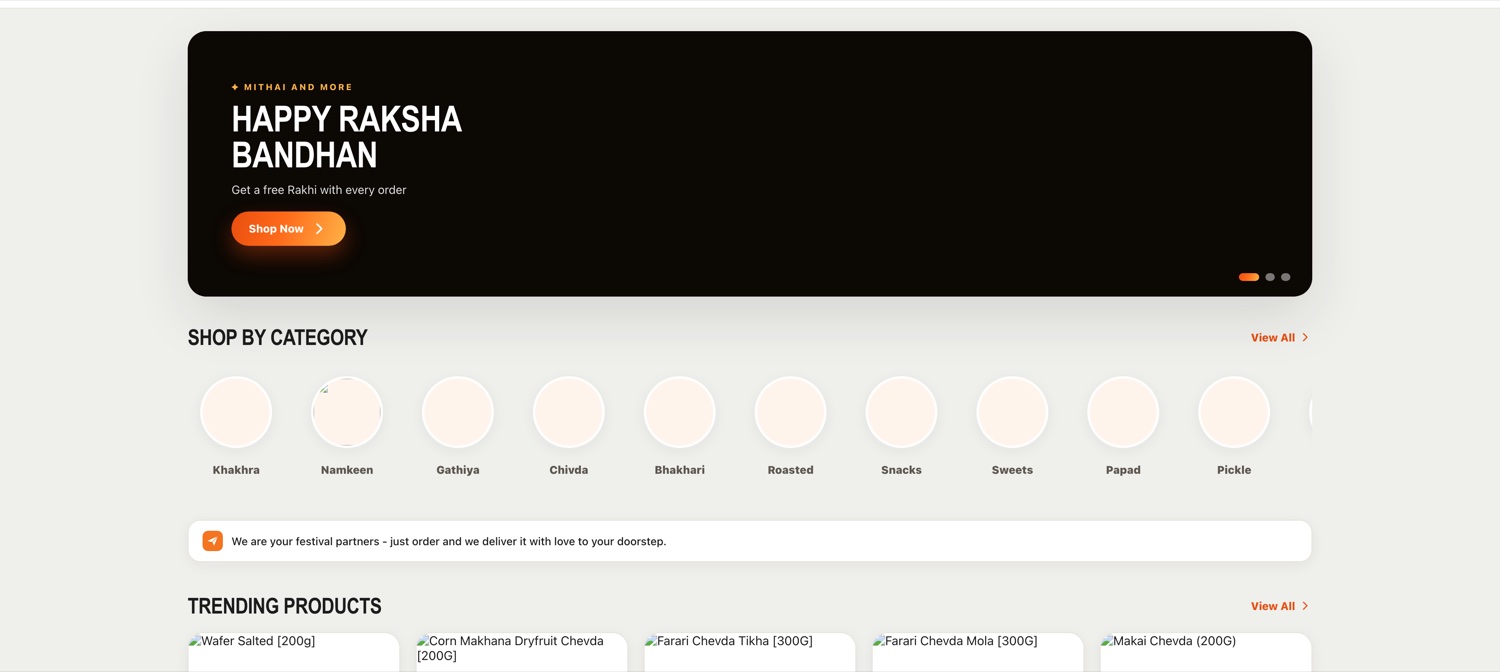
Snacksit
Indian snacks, sweets, namkeen and dry fruits delivered worldwide, door to door, from the brands people actually grew up on.
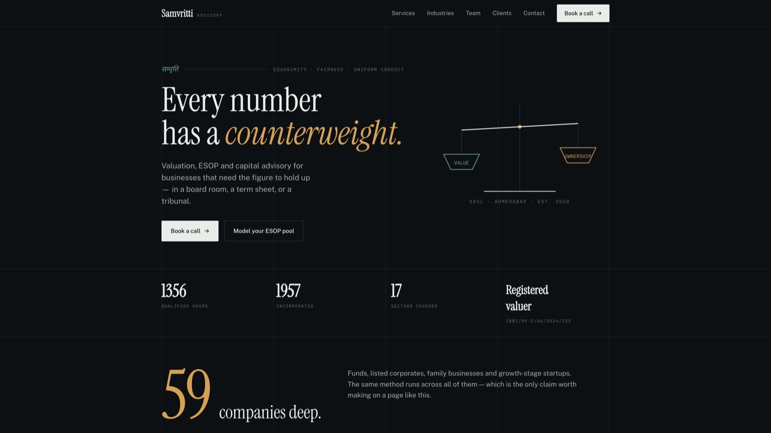
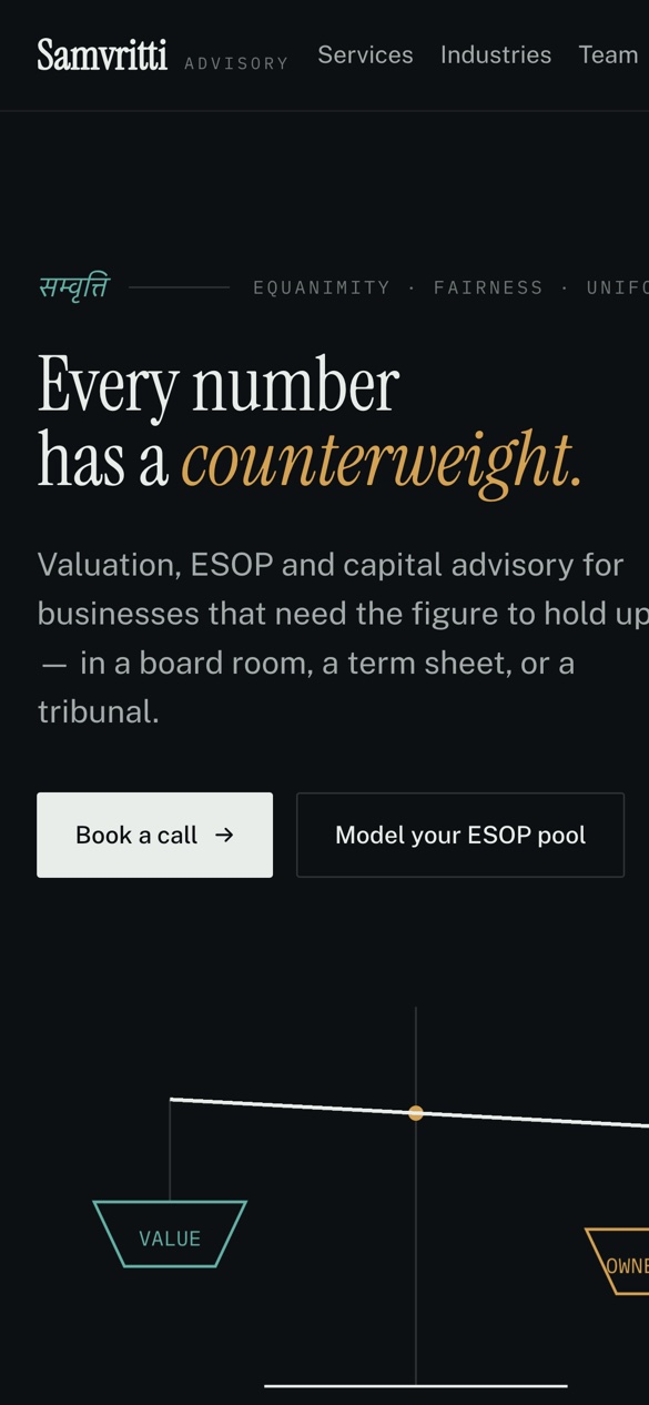
Samvritti
Every number has a counterweight — a financial advisory practice built around showing the working, not just the answer.
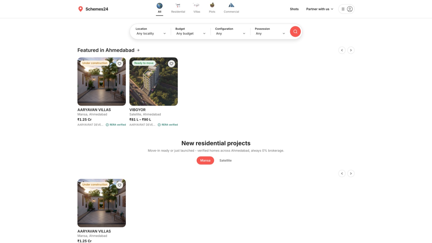

Schemes24
Buy a home from a verified builder, without ten cold calls.